Pantone Colour of The Year 2021
Published: December 18, 2020
It’s that time of year again. No, we don’t mean Christmas (although that too of course!). Every year colour experts Pantone release their “Colour of The Year” predictions for the year ahead. A colour which encapsulates and reflects a moment in time. It’s contentious and fascinating and product designers, interior designers and taste-makers are always watching with interest at the announcement.
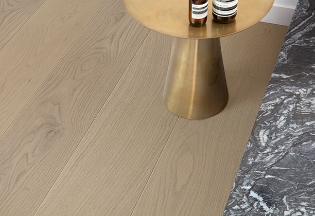
2020 has been a particularly challenging year for many, so it’s no surprise the colours announced focus on looking ahead to a brighter and secure future. Pantone selected not one but two colours for 2021 which has only happened once before. But, this has been a year like no other. Ultimate Gray and Illuminating (yellow) have been selected and will no doubt form the basis of high-end product and material palettes and filter down to the high street not long after. It’s moving away from the earthiness we have seen a lot of lately, but not necessarily incompatible with current trending palettes
Ultimate Gray brings a solid, calming presence while Illuminating is cheerful and optimistic. Individually they offer their own attributes but together they are yin and yang. Grey is a colour we’re familiar with in an interior design sense over the last few years and it’s not a stretch to include this in your home broadly across surfaces. Yellow is a little trickier to navigate and certainly more so than the mustards we have seen in homewares recently.
“The union of an enduring Ultimate Gray with the vibrant yellow Illuminating expresses a message of positivity supported by fortitude. Practical and rock solid but at the same time warming and optimistic, this is a colour combination that gives us resilience and hope. We need to feel encouraged and uplifted; this is essential to the human spirit.”
Leatrice Eiseman, Executive Director of The Pantone Color Institute.

So how do we incorporate these colours into our homes? Here are our tips.
- Treat grey as a base colour, one that can be applied liberally across walls, floors and furniture. Yellow is a powerful colour and best used as an accent in décor, fabrics and linen.
- Don’t necessarily think of the colours as flat surfaces. Certain timber grains, wools, linens and animal hides are naturally grey, or stained/ dyed grey. The texture gives them warmth and variation.
- Yellow can be found in many temporary accents. Think of yellow fruit, such as lemons or pineapples artfully arranged on the kitchen bench or a bunch of happy yellow blooms to treat any room.
- Don’t buy things because they are “on-trend” alone. You should LOVE the colour on its own merits too. This means when trends come and go it matters very little as you still like it. It minimises waste too which is incredibly important.
- Too much grey can feel overwhelming or sterile. Team with warm timbers, textures and contrasting colours to create balance. The wonderful thing about grey is, is that it works back with so many other colours. Yellow, pink, blue, green and jewel tones.

